


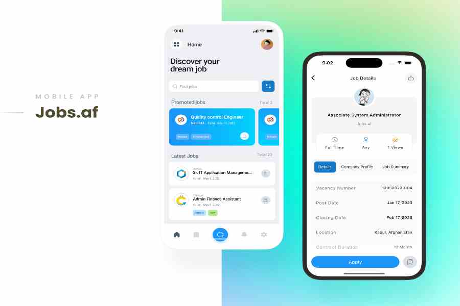
A working mobile app is designed around interaction. A store listing has a different job: it needs to explain the product quickly enough that someone seeing it for the first time understands why it matters.
That is why raw interface captures are rarely enough on their own. They may show the real product, but they do not automatically create a clear visual hierarchy, explain the strongest benefits or adapt naturally across every App Store format.
Store-ready screenshots take the real interface and turn it into a visual launch story.
Working Screens and Store Screenshots Have Different Jobs
A product screen is built to be used.
A store screenshot is built to communicate.
That often means adding:
- benefit-led headlines
- clear device framing
- a consistent background system
- deliberate spacing and hierarchy
- correct store dimensions
- localized copy
- upload-ready exports
The app interface should still remain the hero. The purpose of the design is to make that interface easier to understand, not bury it under decoration.
Choose the Screens That Explain the App Fastest
A strong screenshot set should not try to show every feature.
Instead, choose the screens that answer questions like:
- What does the app help someone do?
- What is the strongest benefit?
- Which feature proves that promise?
- What should the viewer understand first?
- What makes the experience feel distinctive?
- What should the next screenshot explain?
A travel app might begin with discovery, continue with saved journeys and then show trip planning.
A productivity app might begin with planning, move into collaboration and finish with reminders or progress.
The goal is to create a sequence, not a random gallery.
Make Captions Explain the Benefit
Interface labels usually describe what something is.
Store captions should explain why it matters.
Instead of:
“Saved Trips”
a stronger message might be:
“Keep every place you love in one journey.”
Instead of:
“Dashboard”
the screenshot could communicate:
“See your whole day at a glance.”
The product screen provides the visual proof. The caption gives that screen meaning.
Store Formats Should Not Multiply the Work
This is where preparing a professional launch can become repetitive.
iPhone, iPad and Apple Watch each require different compositions and accepted export sizes. Another language can change headline length. A new product screen may require an updated visual without rebuilding the rest of the campaign.
For Apple listings, a purpose-built App Store screenshot generator can turn a short app brief and real product references into a coordinated screenshot campaign rather than forcing teams to rebuild every layout manually.
StoreScreens.ai starts with the app itself. Teams can describe the product in a short brief or import an existing App Store listing, use their real screenshots as references and let the system plan the screenshot narrative, write benefit-led headlines and create the visual direction.
The generator produces dedicated iPhone, iPad and Apple Watch assets at accepted App Store sizes, supports localization across 40 languages and can regenerate a single screen without rebuilding the rest of the set. It also creates supporting App Store copy such as subtitle, promotional text and keyword suggestions.
Adapt the Composition, Not Just the Canvas
A premium screenshot should not simply be stretched from one device size into another.
The visual direction can stay consistent while the composition changes.
On a phone:
- the headline may sit above the device
- the product screen may dominate the vertical layout
- secondary elements should remain minimal
On an iPad:
- the interface can use more horizontal space
- supporting product detail may remain visible
- the composition can breathe more
On Apple Watch:
- hierarchy needs to become dramatically simpler
- only the strongest visual and message should remain
The goal is consistency without forcing every device into the same layout.
Localization Is Also a Design Problem
Translation changes more than words.
A headline that fits perfectly in English may become much longer in another language. Text can wrap differently, spacing may need adjustment and important interface elements can become crowded.
That is why localization works best when the screenshot set is built as a flexible system rather than a collection of fixed image exports.
With StoreScreens.ai, the same set can be localized across 40 App Store languages while preserving the broader visual direction
Build Screenshots That Can Evolve With the App
Store screenshots rarely stay finished forever.
They need to change when:
- the interface changes
- a major feature launches
- a new device format is required
- another market is added
- the product messaging changes
- a new screenshot needs testing
A reusable workflow makes these updates much easier.
Instead of rebuilding the entire presentation every time something changes, teams can refine individual screens while keeping the rest of the campaign visually connected.
Final Store-Ready Checklist
Before publishing the finished set, check that:
- each screenshot communicates one clear idea
- the strongest benefit appears early
- headlines remain readable at store-preview size
- the real product UI is easy to recognize
- each device format looks intentionally designed
- exports use accepted App Store dimensions
- localized versions maintain the hierarchy
- the project can be updated later without starting again
Going from a working app to a strong App Store listing is not simply an export step.
It is where product design becomes product communication.
The best screenshot sets make the app easier to understand, preserve the quality of the interface and turn individual product screens into one coherent launch story.
Leave a Reply